Templates
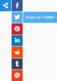
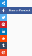
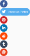
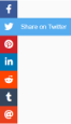
The following are only a few examples of the possible configurations of the sidebar:
-
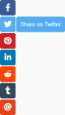
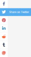
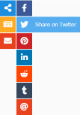
 Template 1
 -
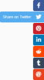
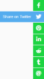
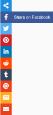
 Template 2
 -
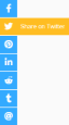
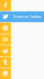
 Template 3
 -
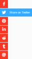
 Template 4
 -
 Template 5
 -
 Template 6
 -
 Template 7
 -
 Template 8
 -
 Template 9
 -
 Template 10
 -
 Template 11
 -
 Template 12
 -
 Template 13
 -
 Template 14
 -
 Template 15
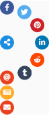
Default buttons
These are the buttons available by default. Alongside them, you can easily create new buttons using the over 1500 icons from the Font Awesome library.
+ Support to add new custom buttons!
Buttons can have several functions:
- - Share: Open the share window for the specified service.
- - Link: Opens the given link.
- - Mailto: Opens the mailto window.
- - Print: Opens the page print dialog.
- - Window: Opens an overlay window with custom content.
- - Subbar: Opens a sub list of buttons.
Default share services
These are the share services available by default. Alongside these, you can easily add new share services through the settings.
+ Support to add new share services!
Settings
The following settings can be specified in the JS build code:
| Name | Default value | Possible values |
|---|---|---|
| // Main | ||
| position | ["left", "center"] | [<horizontal>, <vertical>], ["left", "center"], [10, 20] |
|
The position of the sidebar. The format is [<horizontal>, <vertical>]. Horizontal values are "left" and "right" and the vertical values are "top", "center" and "bottom". Additionally, the values can be exact numbers like 10 (px) or percentages like "20%". |
||
| offset | [0, 0] | [<horizontal>, <vertical>], [10, 20] |
|
The offset in position starting from the position setting. These values are added to the positions calculated previously. The format is [<horizontal>, <vertical>] where the values are numbers. |
||
| buttonShape | "round" | "square", "round", "rounded", "rounded-out" |
|
The shape of the buttons. It also determines the shape of the labels. |
||
| buttonColor | "default" | "default", "blue", "red", "yellow", "green", "white", "black" |
|
The color of the buttons. These are only a few default color options, you can edit the CSS code and add any colors you want. |
||
| buttonOverColor | "default" | "default", "blue", "red", "yellow", "green", "white", "black" |
|
The color of the buttons on mouseover. These are only a few default color options, you can edit the CSS code and add any colors you want. |
||
| iconColor | "white" | "default", "blue", "red", "yellow", "green", "white", "black" |
|
The color of the button icons. These are only a few default color options, you can edit the CSS code and add any colors you want. |
||
| iconOverColor | "white" | "default", "blue", "red", "yellow", "green", "white", "black" |
|
The color of the button icons on mouseover. These are only a few default color options, you can edit the CSS code and add any colors you want. |
||
| labelEnabled | true | true, false |
|
If the button labels should be enabled. |
||
| labelColor | "match" | "default", "blue", "red", "yellow", "green", "white", "black", "match" |
|
The color of the button labels. If set to "match", it will correspond with buttonOverColor. These are only a few default color options, you can edit the CSS code and add any colors you want. |
||
| labelTextColor | "match" | "default", "blue", "red", "yellow", "green", "white", "black", "match" |
|
The color of the button labels text. If set to "match", it will correspond with iconOverColor. These are only a few default color options, you can edit the CSS code and add any colors you want. |
||
| labelEffect | "slide-out-fade" | "fade", "slide-out", "slide-out-fade", "slide-in", "slide-out-out", "slide-in-in", "none" |
|
The appearance effect of the button label. Certain effects (like "slide-in" or "slide-out-out") cannot work with labelConnected: true and so, if chosen, they will reset labelConnected to false. "slide-in" includes fade so there is no separate "slide-in-fade". |
||
| labelAnimate | "default" | [<time>, <ease>], [400, "easeOutQuad"], "default" |
|
The animation parameters of the label effect. The time is in milliseconds and for the easing, see the Easing options at the bottom of the table. Different effects have different default values so you can just set "default" and the sidebar will automatically pick the defaults for that effect. |
||
| labelConnected | false | true, false |
|
If the button and label should be visually connected or not. If they are connected, when the label appears, it looks like it expands from the button. |
||
| sideSpace | false | true, false |
|
If there should be space on the side of the bar. |
||
| buttonSpace | false | true, false |
|
If there should be space between the buttons. |
||
| labelSpace | false | true, false |
|
If there should be space between the label and the button. |
||
| // Subbar | ||
| subPosition | ["circular",105,-90,90] | "under", "side", ["circular", <radius>, <start rad>, <end rad>] |
|
The position of the subbar. It can be "under" the button, on the "side" of the button or "circular", around the button. If it is "circular", there are other values that can be included such as the radius of the circle and the start and end radians. |
||
| subEffect | "slide" | "fade", "slide", "linear-fade", "linear-slide", [<effect>, <interval>], "none" |
|
The appearance effect of the subbar. For the "linear-fade" and "linear-slide" effects, the value can be an array with the effect name and the interval in ms between the animation of each button: ["linear-fade", 30]. |
||
| subAnimate | [400, "easeOutQuad"] | [<time>, <ease>], [400, "easeOutQuad"], "default" |
|
The animation parameters of the subbar. The time is in milliseconds and the easing options are listed in the Guide. |
||
| subSpace | false | true, false |
|
If there should be space between the subbar and the button. |
||
| subOpen | "mouseover" | "mouseover", "click" |
|
If the subbar should be opened on mouseover or on click. |
||
| // Window | ||
| windowPosition | ["center", "center"] | [<horizontal>, <vertical>], ["center", "20%"], ["center", 20] |
|
The position of the window. The format is [<horizontal>, <vertical>]. Horizontal values are "left", "center" and "right" and the vertical values are "top", "center" and "bottom". Additionally, the values can be exact numbers like 20 (px) or percentages like "20%". |
||
| windowOffset | [0, 0] | [<horizontal>, <vertical>], [10, 20] |
|
The offset in position starting from the windowPosition setting. These values are added to the positions calculated previously. The format is [<horizontal>, <vertical>] where the values are numbers. |
||
| windowCorners | "match" | "square", "round", "match" |
|
The type of the window corners. If set to "match", it will correspond with the shape of the buttons. |
||
| windowColor | "match" | "default", "blue", "red", "yellow", "green", "white", "black", "match" |
|
The color of the header of the window. If set to "match", it will correspond with buttonColor. These are only a few default color options, you can edit the CSS code and add any colors you want. |
||
| windowShadow | true | true, false |
|
If the window should have a shadow or not. |
||
| windowDraggable | true | true, false |
|
If the window should be draggable from the header or not. |
||
| // Other | ||
| showAfterPosition | false | <scroll position>, false |
|
If the sidebar should be shown only after the page was scrolled beyond a certain point. |
||
| barAnimate | [250, "easeOutQuad"] | [<time>, <ease>], [250, "easeOutQuad"], "default" |
|
The animation parameters of the bar. The time is in milliseconds and the easing options are listed in the Guide. |
||
| hideUnderWidth | false | <page width>, false |
|
If the sidebar should be hidden when the browser window is under a certain width. |
||
| shareTarget | "default" | "blank", "popup", "default" |
|
How the share window will be opened. "blank" to open the page in a new browser tab/window, "popup" to open the page in a popup window or "default" to use the default setting for each button. |
||
| animateEngine | "velocity" | "velocity", "jQuery" |
|
Which engine to use for animations. When using "jQuery", it is no longer necessary to load the velocity.min.js file on the page. |
||
| // Extra | ||
| shareServices | {...} | <new share services> |
|
Adds new or changes the existing sharing services. More information is explained in the "Add a share service" section of the Guide. |
||
| formData | { } | <forms data> |
|
Specifies data to be used by the window forms. More information is explained in the "Window form" section of the Guide. |
||